Art Work & Color Guide Label Artwork
To produce your custom clothing label, we require your artwork in digital format. We undertake orders ranging from a few pieces to 10,00,000 pieces and deliver them in shortest possible time.
Artwork for custom woven or printed label production can be emailed to us at info[at]hilifelabels[dot]com. The preferred format of artwork is Adobe Illustrator or Adobe PDF format or JPEG file of 300 - 600 dpi. We request that customers email both versions for our file reference.
Once the client submits an artwork attachment, we will respond to the request as soon as possible. This is done by email or phone to confirm that we received the artwork and discuss any questions pertaining to the client's artwork. Upon satisfactory conclusion of all points pertaining to the artwork details, size and colours, we begin the proof sample process. This typically takes anywhere from 1 - 3 days for woven labels, longer for other labels. The length of time depends on the complexity, size and type of label. Once the proof is approved, production of the label begins. Custom Label Pricing

|
Actual pricing for custom labels vary according to size, type of material, number of colours, and type of fold or backing requested. For a custom label price quote, contact us. We will respond with our best quote and delivery time, as soon as possible. |
Clothing Label Colours
  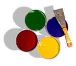
Selection of colours for your clothing label is done through pantone colour codes. We use both textile pantone codes and paper stock pantone colour codes.
Decide which colour you need for ground and other letters. The ground colour is the base of the clothing label on which the text or other logo colour yarns are woven. Next, we require the colours requested for your logo or text artwork.
When choosing a ground colour and a logo or text colour, select colours that are distinct and separate from one another. Similarly ground colours and text / logo colours often blend together resulting in low clarity and colour separation. For example if the ground colour is light magenta and your text is light pink, the text and ground may both too light to distinguish the writing or logo. A better selection in this case is contrast or Light and Dark Shade of colours.
|